
BLUE MOON REDESIGN
Bringing Flavor To The Digital Experience


QUICK OVERVIEW
MY ROLE
UX Design
UI Design
UX Research
Website Design
TOOLS
Figma
IOS Kits
Lookback User Testing
TIMELINE
4 Weeks
The digital landscape for restaurant websites has evolved significantly since the ’90s. Users now expect to easily access customer reviews, up-to-date menus, and essential restaurant information including hours and location. The Blue Moon Grill required a modern website that provided all of this in a user-friendly layout with clearly organized sections, and it needed to be fully responsive across all devices.
THE MISSION
The goal of this project was to design a website that would enhance the customer experience by providing quick and intuitive access to key restaurant details. By prioritizing usability and responsiveness, the mission was to create a platform that met the needs of modern users while capturing the unique character of The Blue Moon Grill. This involved ensuring that the site not only looked visually appealing but also functioned seamlessly across all devices, making it easy for customers to discover, navigate, and connect with the restaurant.
DISCOVERY
THE PROBLEM
The Blue Moon Bar and Grille’s website was long overdue for a modernization, having remained untouched since 1997. The client sought to transform the site into a more contemporary and engaging marketing tool, providing users with an intuitive way to explore the restaurant, access essential information, and be drawn to choose it for their dining experience. I focused on modernizing the user experience and interface, streamlining navigation across all devices, and creating a website that effectively showcases the restaurant’s brand and appeal.
BEFORE THE REDESIGN

IDENTIFYING PAIN POINTS & OPPORTUNITIES
I conducted a competitive analysis to understand my competitors strengths, weaknesses, opportunities and threats. These findings informed my design choices, emphasizing the need to: create an “About” page that showcases the history, cuisine and story of the Blue Moon Bar and Grill, a simple yet elegant design that is user friendly and food and drink menus that are navigable with pricing information

INTERVIEW TAKEAWAYS
All interviewees had prior experience searching for restaurants online.
The majority of interviewees used search engines, such as Google, to discover local restaurants.
Familiarity with restaurant websites
Most users preferred a straightforward design for a restaurant website rather than one that was overly visual.
Interviewees expressed that a clean, minimal design made it easier to find key information quickly, such as menus and hours.
Design preferences
Pain points
Users often had trouble locating essential details like restaurant hours and location, leading to frustration.
Multiple interviewees noted encountering unnecessary or repeated buttons, which made navigation feel cluttered and inefficient.
The absence of clear "back" buttons and other navigational issues created a disjointed experience, making it harder for users to browse smoothly.
AUDIENCE
The primary audiences for the Blue Moon website include local professionals seeking nearby dining options for lunch or dinner, college students searching for convenient and affordable meals, and tourists eager to explore new dining experiences while visiting the area. These diverse user groups each have unique needs and preferences, from quick accessibility and affordability to discovering a unique and memorable culinary destination.

CLIENT EXPECTATIONS & COMPROMISES
During the initial client interview, I suggested incorporating online ordering and reservation features to enhance user convenience and streamline operations. However, the client opted not to include these features, citing concerns about overwhelming their kitchen staff and maintaining service quality in their current space. These insights informed the final design, which focuses on showcasing the menu, hours, and contact information while supporting the restaurant's operational limitations.
FURTHER UNDERSTANDING OUR USERS

User stories and user flows played a pivotal role in the Blue Moon Redesign, serving as the foundation for understanding and anticipating our users' needs. By mapping out the key interactions and scenarios users would encounter, we were able to identify potential pain points and areas for improvement. This approach allowed us to craft a website experience that feels intuitive, guiding users effortlessly through actions like browsing the menu, making reservations, or placing online orders. Ultimately, this focus on user-centered design ensured that every element of the website contributed to a more seamless and enjoyable journey, meeting both user expectations and business goals.
USER FLOW

USER STORIES
As a customer, I want to view the restaurant’s full menu online, so I can decide what to order before visiting.
As a customer, I want to easily find the restaurant’s location and contact information, so I can make reservations or get directions.
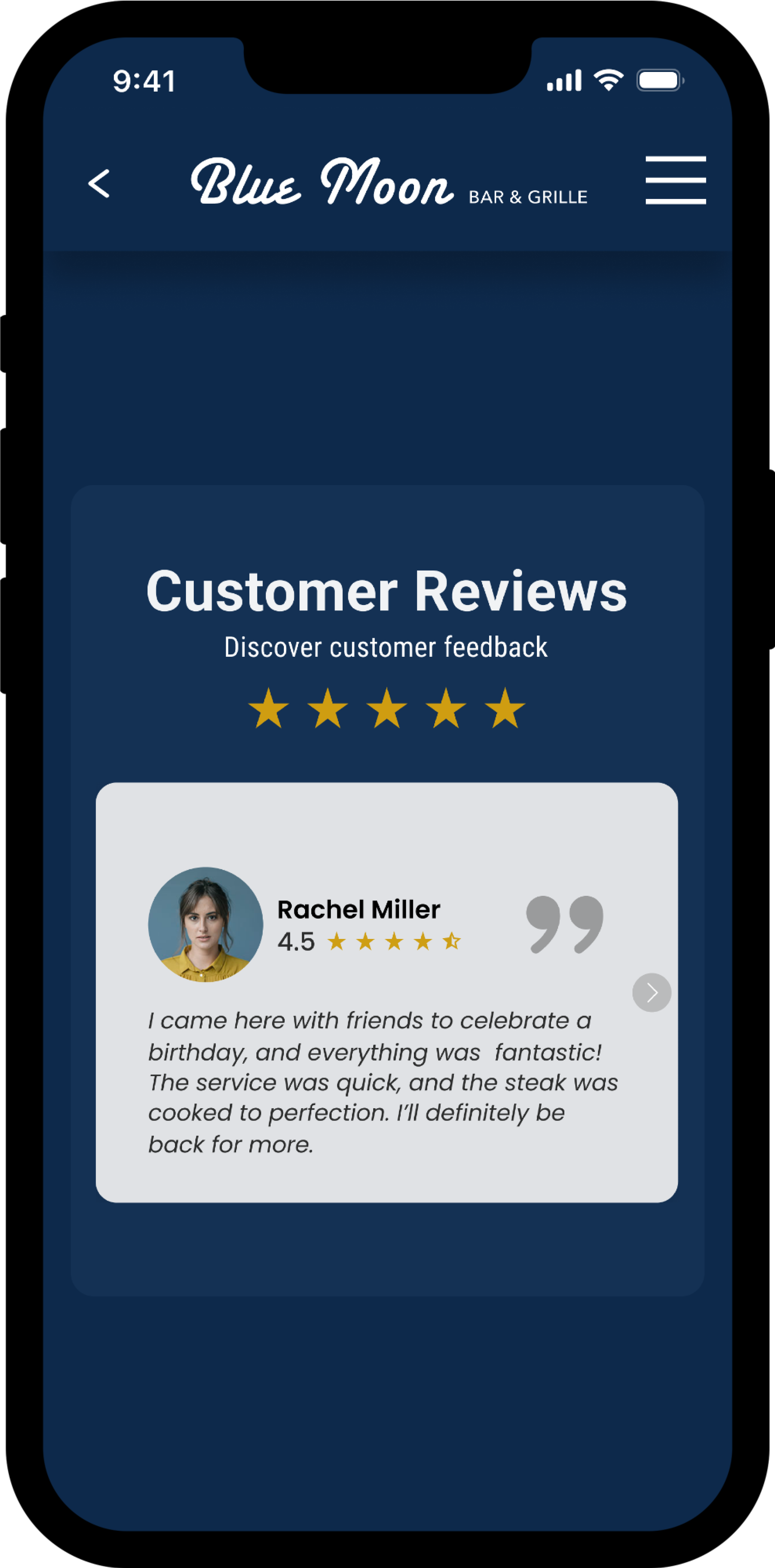
As a customer, I want to see customer reviews and ratings, so I can trust the restaurant’s quality and service
PERSONA

ITERATE, TEST, IMPROVE
SKETCHES

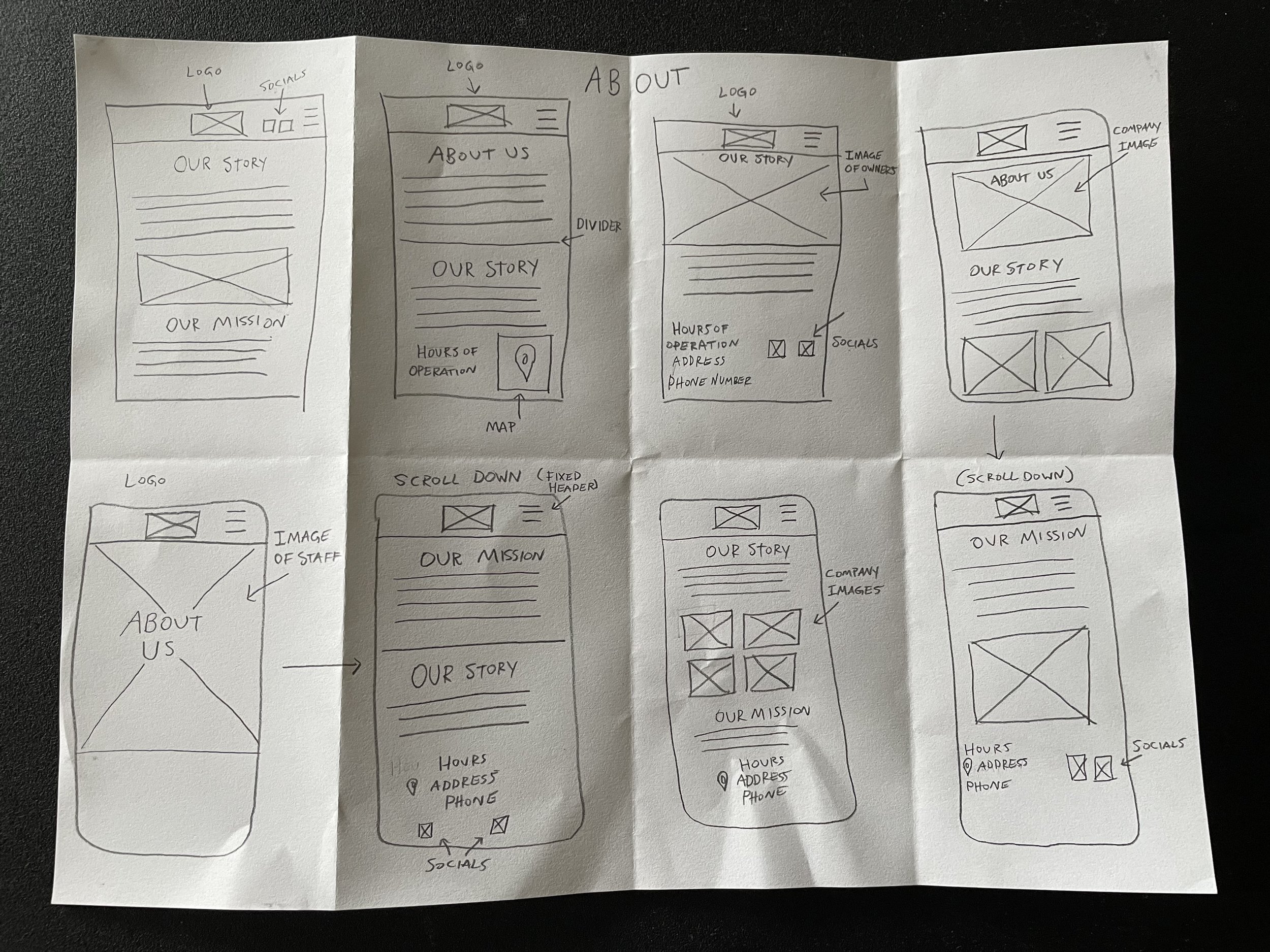
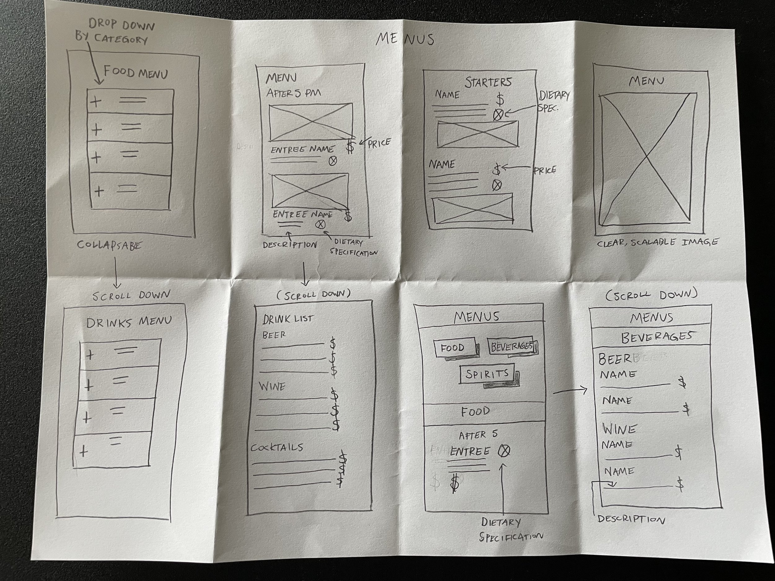

WIREFRAMES


BRANDING
Branding was vital in bringing the Blue Moon site to life.
LOGOS

STYLE GUIDE

USABILITY TESTING
Task 1: Navigate the Food/Drink Menus
Task 2: Navigate the Home Page
Task 3: Find information About the restaurant
Task 4: Find Location, Hours & Contact Information
Task 5: Find Customer Reviews
Task 6: Book an event
Task 1: Navigating the Food/Drink Menus
For Task 1, users said that they did not believe that “Spirits” should be included as a Menu option.
Users also mentioned that the Navigation Header on the Menu pages was not fixed and that it would disappear
Users mentioned that navigating the Menus could be more seamless, and that it would be better to be able to toggle between Food & Drinks at any point, without having to go back every time. The drop down menus should close when you click anywhere outside of them
Task 2: Navigate the Home Page
Users indicated that the logo in the Navigation Header should link to the Home Page.
Users also mentioned that the Hours, Location and Phone number should be visible on the Home Page.
Book An Event is a secondary call to action, so it should be featured down the home page but not immediately visible.
Task 3: Find Information About the Restaurant
Change main image to not take up the whole screen (consistent layout)
Change main image to something that brings life to the website/restaurant (not an image with stacked chairs and no people)
Add more images to Our Mission and Our Story sections
Task 4: Find Location, Hours & Contact Information
Change section from “Hours + Location” to “Contact” to decrease cognitive load
Users wanted Location, Hours & Contact to be on the Home Page as well
Task 5: Find Customer Reviews
Instead of including Reviews in the About section, users stated that they should be found on the Home Page, after scrolling down
Users thought that multiple reviews should be available to read
Task 6: Book An Event
Users mentioned that instead of having a hard confirmation, customers should receive a pending message.
Users also thought that the text size on the Book An Event section was too big
FINAL THOUGHTS
My user tests provided valuable insight into what changes needed to be made throughout this process. I created a simplified, intuitive and user friendly version of the previous website. The usability tests revealed where users expect to find vital information on a restaurant website and how it should be organized. I also made sure that accessibility standards of the website were met, ensuring usability for all users. After making the changes, I considered the website to be complete, designed with the user’s needs, goals and expectations in mind.